Hello
Everyone,
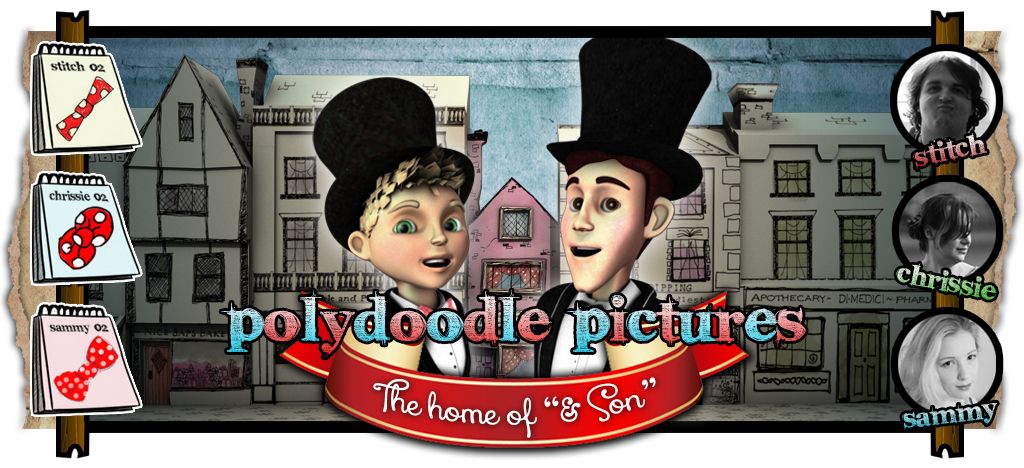
A couple of weeks back (prior to April 14th) Phil asked us to provide a number of images from our respective Minor and Major projects to promote us at New Designers. Stitch was placed in charge of sending 2-5 respective images from our Minor project with Sammy handling the Major. These were the images Stitch chose to send just to give people an idea (in a single image) of the characters personalities. He also rendered out some environment and 2D prop renders which fall within the purview of the minor project.

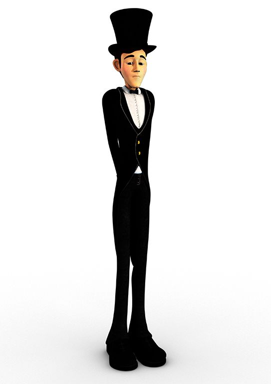
The first image was Benjamin Badgersworth pulling his "Tah-Dah" pose technically this is a major project pose but we figured why not. This is where the lighting was experimented with and its more or less how we found an effective balance of shaders vs. light. This is actually where Stitch decided to base our feature renders on a more washed out skin tone like the Benjamin render above.
The next image is Barnabas reserved in his rigid demeanour the key feature is the expression of his face. The team originally thought the pose was too dull but were persuaded when Stitch pointed out that these poses were to show the characters personalities. On the one hand you have Benjamin flexible, care free and looking to have fun on the other you have Barnabas rigid, rejecting hope still in pain on the inside.

For the group shot Stitch returned to one of the earlier group pose tests which he liked from a prior post which can be found
here. He believed this pose conveyed the dynamic between the two characters with the entire influence to show in 3 images who these characters are. From this group pose you get a panicked father looking at a mischievous son. That was the goal here.
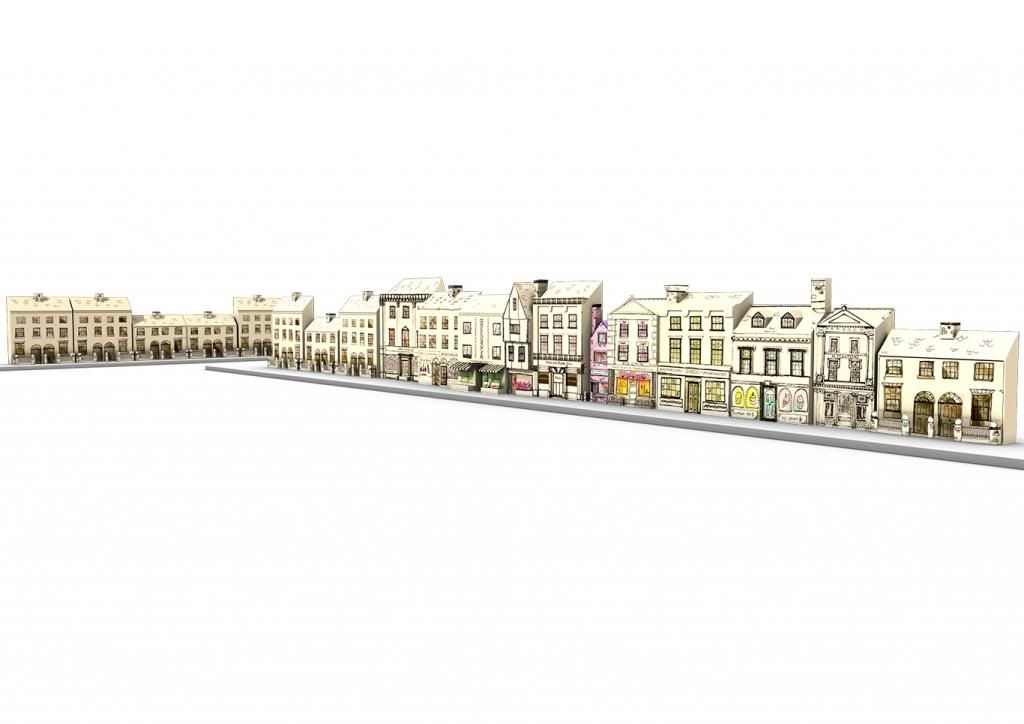
The next image was our setting so Stitch went to the exterior parlour to try and grab a render of all of the buildings. The problem with doing it this was made the render appear quite small. Never the less he wanted the masses to be able to appreciate the work of Chrissie Peters stunning exterior environment. So now we have the character identities and now where they live.
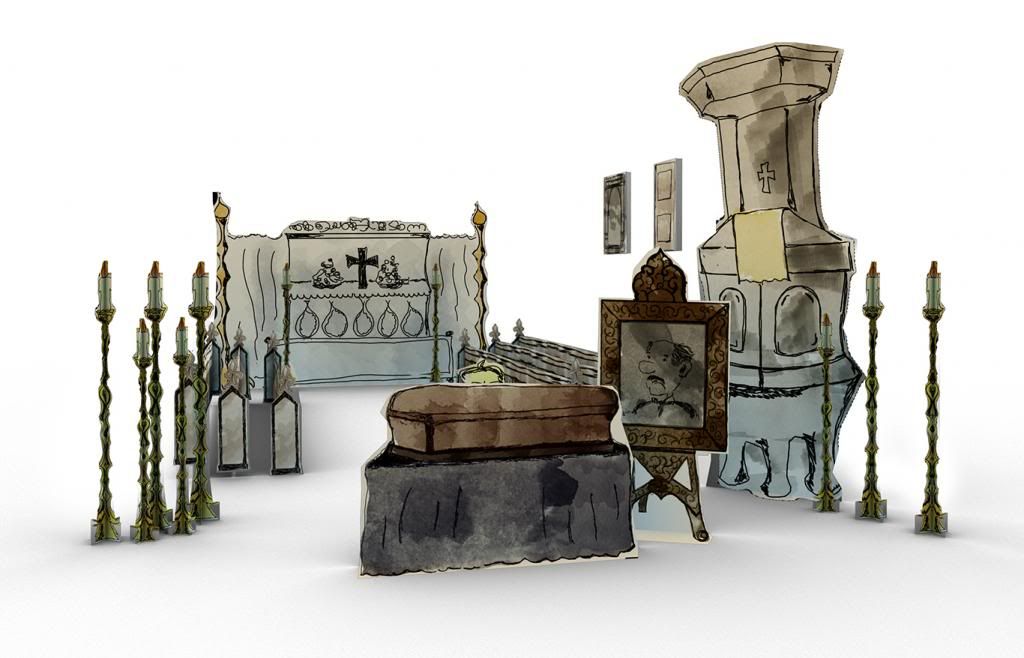
Last but not least he thought some prop concept was in order to show the "2D ness" of our world. It was also placed so people would understand our characters profession if words were not enough. This image perfectly conveys what this story is surrounding... Mortality. Each image Stitch chose was to convey meaning above all else and provide a little insight into what this short is about. Well those were it for the minor.
Cheers people.
xXStItChXx


No comments:
Post a Comment